Creating visuals

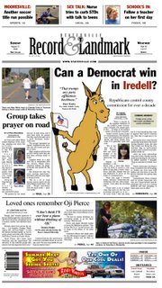
Here are two examples of solutions to less-than-leadable art. The donkey example was the result of a front page with a good centerpiece story. It delved beyond what happened (as most stories seem to focus), and centered on an issue of interest to many readers, no matter their political leanings.
But it is hard for a centerpiece story to stand on a front page without some sort of art leading you into it. The solution? A goofy cartoon of a Democratic donkey looking questioningly into the story. To bring across the expression on the donkey's face is a question headline. Although perhaps too subtle for most readers, the spot red "Iredell" in the headline was a hint at the county's Republican background.
Cartoons may not always work, especially not on a front page. But as the editor said for this particular example, it was "just goofy enough" that it would draw readers into the story. Plus it is much better than centerpiecing the other options: a prayer walk and a funeral.
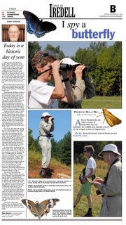
Which leads me to another possible problem. For this photo essay page, we had six photos to choose from. Three with people, and three with butterflies. The three with people included shots of the same two people. The three with butterflies had excessive dead space around the butterflies, and were in desperate need of cropping.
How do you fill a page without boring the reader with the same information?
For this page, the butterflies became the focus by taking them "out of the box," or photo crop. They were expanded to look life-sized. Spot color was pulled from the butterflies and used in the display text.
The photos were cropped to appear as if at least different things were happening, even if they happened with the same people.
Editors will often say there is no good art with a story. A good designer will find ways around that.

