Saturday, September 02, 2006

Creating visuals


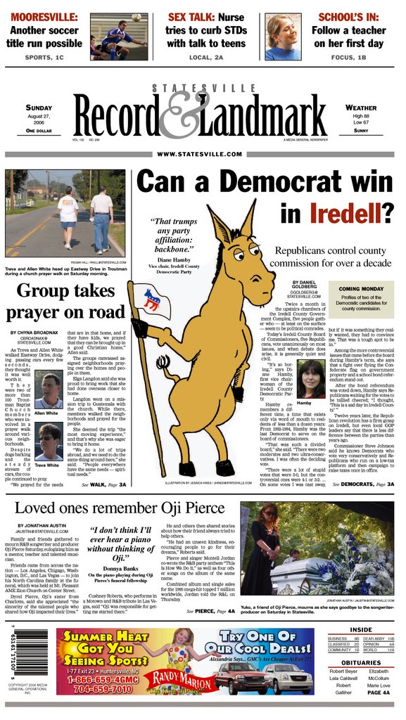
Here are two examples of solutions to less-than-leadable art. The donkey example was the result of a front page with a good centerpiece story. It delved beyond what happened (as most stories seem to focus), and centered on an issue of interest to many readers, no matter their political leanings.

But it is hard for a centerpiece story to stand on a front page without some sort of art leading you into it. The solution? A goofy cartoon of a Democratic donkey looking questioningly into the story. To bring across the expression on the donkey's face is a question headline. Although perhaps too subtle for most readers, the spot red "Iredell" in the headline was a hint at the county's Republican background.

Cartoons may not always work, especially not on a front page. But as the editor said for this particular example, it was "just goofy enough" that it would draw readers into the story. Plus it is much better than centerpiecing the other options: a prayer walk and a funeral.

Which leads me to another possible problem. For this photo essay page, we had six photos to choose from. Three with people, and three with butterflies. The three with people included shots of the same two people. The three with butterflies had excessive dead space around the butterflies, and were in desperate need of cropping.

How do you fill a page without boring the reader with the same information?

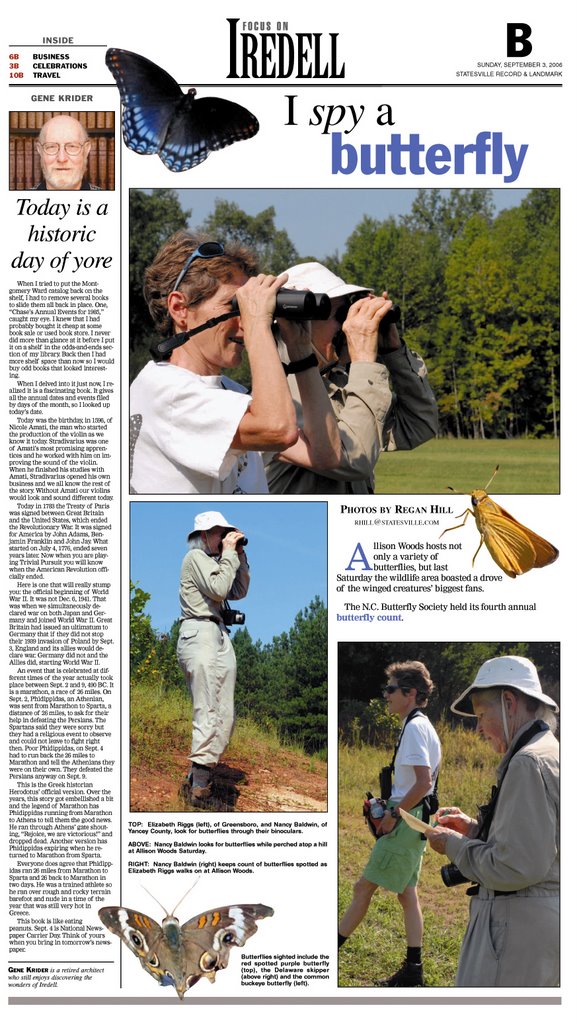
For this page, the butterflies became the focus by taking them "out of the box," or photo crop. They were expanded to look life-sized. Spot color was pulled from the butterflies and used in the display text.

The photos were cropped to appear as if at least different things were happening, even if they happened with the same people.

Editors will often say there is no good art with a story. A good designer will find ways around that.

Wednesday, August 16, 2006

Masking


Masking is a great tool when creating images in PhotoShop. It can be used for non-permanent erasing, or for more flexible shapes and textures.

Masks can be as complex as they can be simple. The most basic mask can be applied to photos.

Open a photo in PhotoShop. In the layers palette, select your background layer and apply a mask to it (the button is at the bottom of the palette, and looks like a square with a round hole). To create the mask, be sure you have the mask selected (it is a square beside the thumbnail of the photo in the layers palette). With your eraser or brush, paint (or erase) white or black. (Eraser: black is add, white is erase; Brush: reverse).

At any time you can delete the mask and the photo will be untouched. Just be sure when you are erasing or using the brush tool that you are certain you are on the mask.

For more complex masking, use set folders. Create a folder in the layers palette with several layers. Select the folder and apply a mask.

For the example given above, I created the helmet logo as several different vector shapes, then put the different layers into a set folder. I then created a selection of the helmet (ctrl click or apple click), clicked on the folder and then hit the mask tool.

As you can see, there are many variations you can use for almost any application. When saving images, be sure to save a layered copy in case you want to make changes later.

Wednesday, June 28, 2006

When the Art is Gone...

The photographers shot nothing worthy of centerpiecing. You have no separate graphics staff and you are a half day away from page deadline. What do you do?

My first suggestion would be to centerpiece a stand-alone photo. Photographers can usually find something visually interesting in the immediate vicinity to make deadline. If not, it may be up to you to spice up what would be a text-heavy design.

The following is an example of a centerpiece created when there was no other option. Is it successful? You tell me.

Monday, June 26, 2006

Sports and Such

The sports section is fun to design. Not only is there usually a clear winner and loser, there is plenty of emotion attached to the event. Photographers usually file better photos, and quotes are more vivid and readily available. Below is an example of a sports page front that I created. I posted it because I attempted to create some variety. I could have put a display headline above the centerpiece photo and cropped the image, but instead decided to make the headline part of the negative space in the photo. If you'll notice, the soccer ball slightly covers the last letter in the headline, embedding the overset text.

Please feel free to give feedback on pages posted here.

Wednesday, May 31, 2006

Cutouts

The cutout is an elusive yet sometimes overused element in news design. It has its appeal. In a world of modular design, an organic shape seems the all-to-easy answer for variety. Unneccesary cutouts can make a page look sloppy or hard to follow.

I recommend three steps in determining if your page can use a cutout efficiently and successfully.
  1. Can your photos support a cutout? Is the subject in clear focus? Is there a lot of hair or fur that may cause extra work or detailing?
  2. Can your page support a cutout? Does it have visual breathing room? With what will the cutout compete (is it the dominant art)?
  3. Can your story support a cutout? "Fancy" designs do not make bad stories good. Readers should not be tricked into reading a below average story because of an above-average design.

If your page, photo and story can each support a cutout, there are various way to create the effect.

  1. Layer Masks. In Photoshop, open the photo and double-click the background layer. Hit OK to make this layer 0. Click the layer and then the mask button at the bottom of the layers palette. With the mask selected, use the default colors (apple-d or ctrl-d) to paint or erase areas not to be used. Painting with black erases, and erasing with black adds (and vice versa). You can soften edges by adjusting your brush. When finished, save as a TIF with no layers. This creates a white background where the photo will not be seen.

    What if you want the cutout to go above another element on the page, so a white background won't work? Two options, depending on your pagination program. If using InDesign, save the file as a layered Photoshop file (PSD). Import the file into InDesign. Note: This may cause problems in exporting, and some older RIP processes may kick back the PDF or post script file.

    If using Quark, use the clipping path method described next.
  2. Clipping Paths: Open the image in Photoshop. In the layers palette, click the Paths tab. Create a new path by clicking the button at the bottom of the palette. In the additional options menu (the circle with a triangle near the top of the palette), select clipping path. Hit OK.

    With the freeform pen tool, be sure the magnetic option is turned on at the top of the screen, then click and outline the subject in the photo. The magnetic pen will detect edges, but it will be rough. You can fine tune later. To close the clipping path, the pen tool cursor will show a circle. Once the path is complete, click on the direct select tool (the white arrow tool). Use this tool to move anchor points and handles until the path closely follows the subject's edge.

    Save the image as a TIF. The area outside the clipping path will disappear when it is placed into InDesign or Quark.